
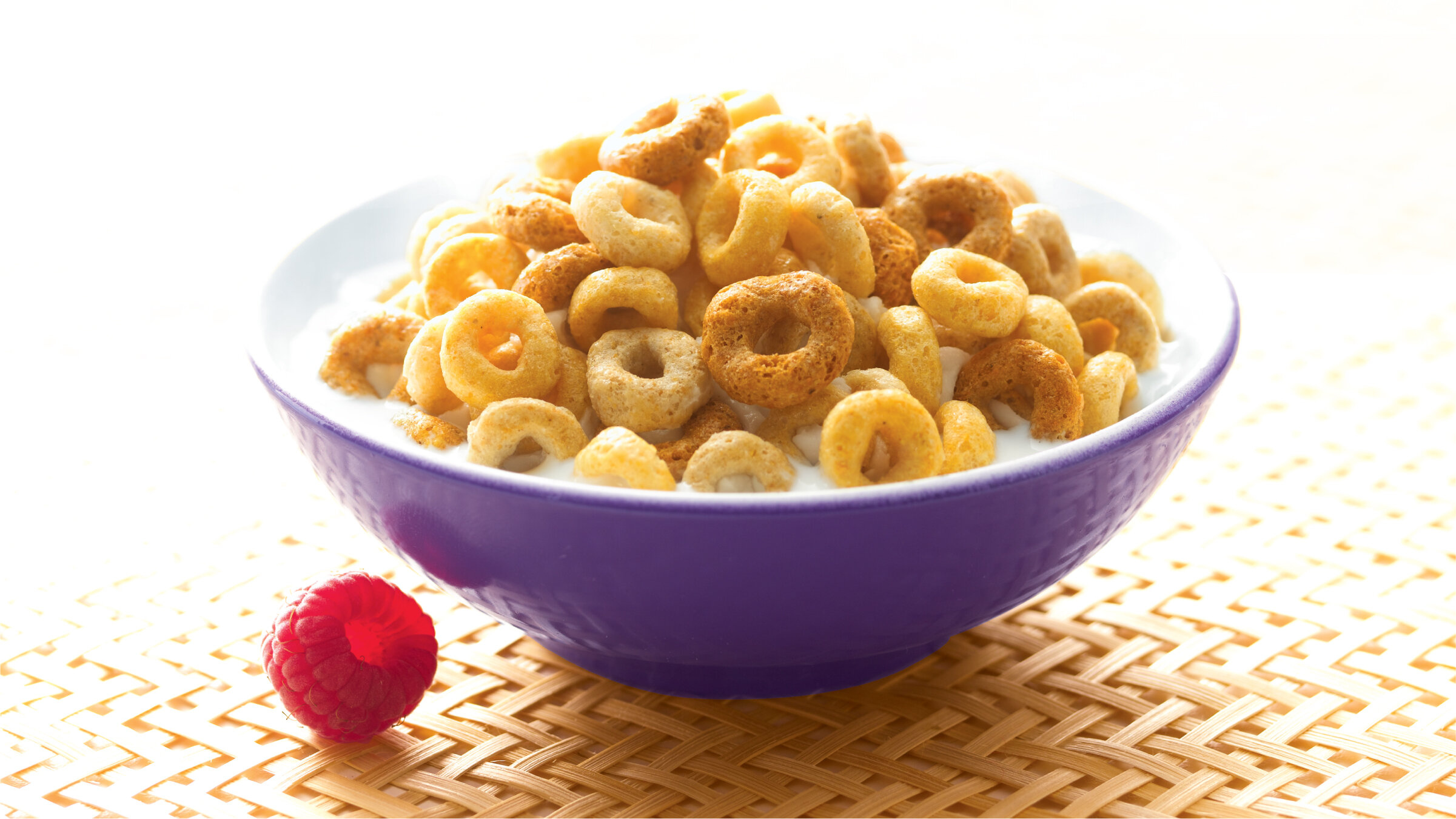
CHEERIOS
Taking a “franchise approach” to our redesign of the Cheerios portfolio resulted in a simplified, more impactful and consistent look to General Mills’ heavy hitting cereal line-up.

CHEERIOS CEREAL / GENERAL MILLS
By unifying all brand marks, product positioning and placement, and key news areas on the package, consumers were led to have a richer brand experience. Through this strategic and thoughtful redesign, BAKER created the opportunity for a Cheerios brand destination at shelf.
We have been named one of the Best Graphic Design Companies by DesignRush!


The one and only logo.
Prior to BAKER’s redesign of the entire Cheerios portfolio, each flavor variety had developed a slightly different iteration of the Cheerios logo over time. Only by taking a step back, and with careful consideration given to each letterform, were we able to unify the brand under a singular, cohesive mark.


Related Work


