A BAKER CASE STUDY
BAUER HOCKEY
Redefining a Game Changer
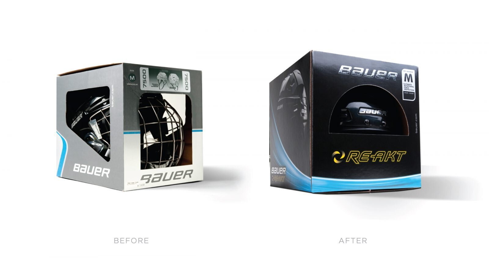
When Bauer, the worlds most recognized name in hockey wanted to introduce an entirely new segment to their hockey family, they passed to team Baker.
THE CHALLENGE
When the biggest name in hockey skated through the BAKER doors looking for opportunities to optimize their on shelf presence, we knew we had to be on top of our game. From the board room to the back room, BAKER teamed up with Bauer, to elevate their premium experience and keep the tough competition in check.
BRAND.THINK
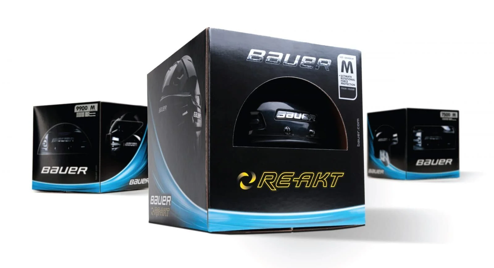
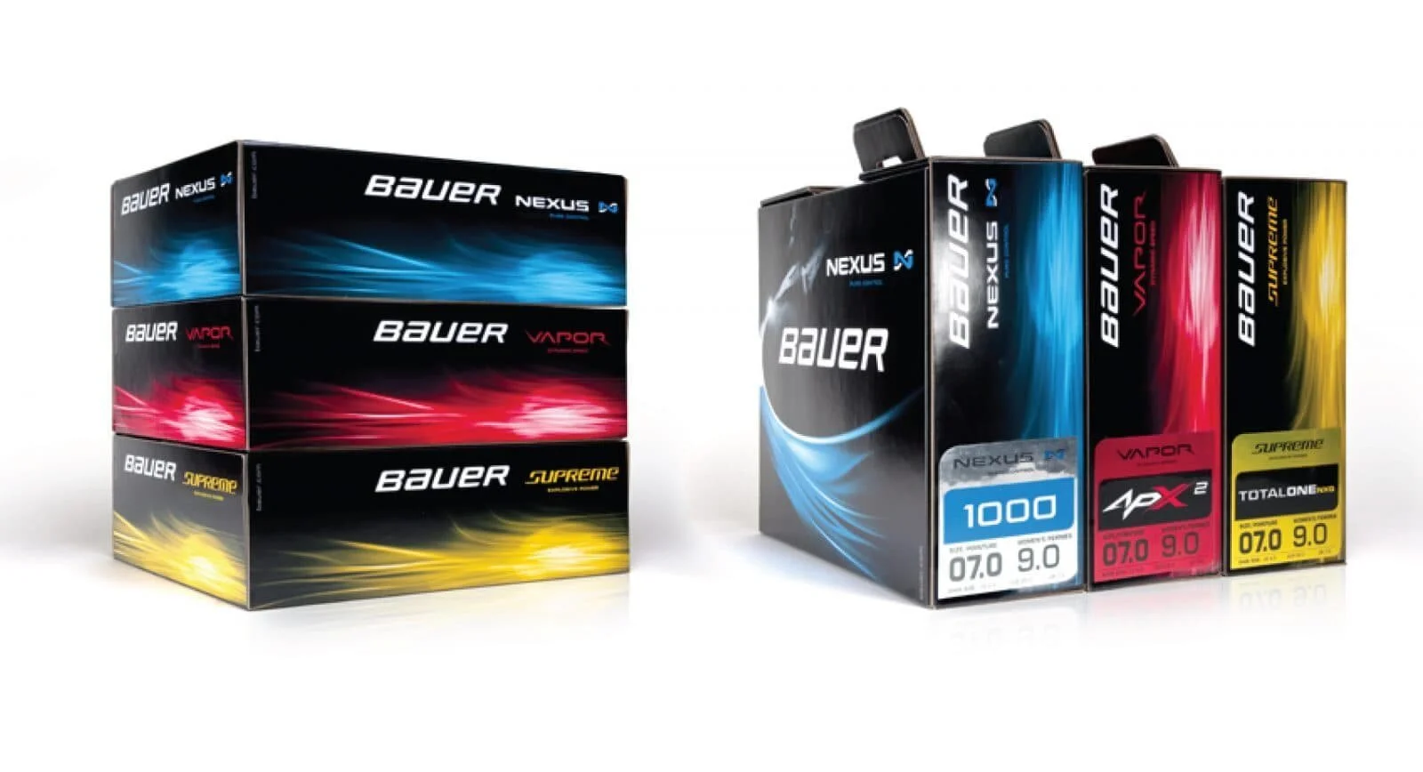
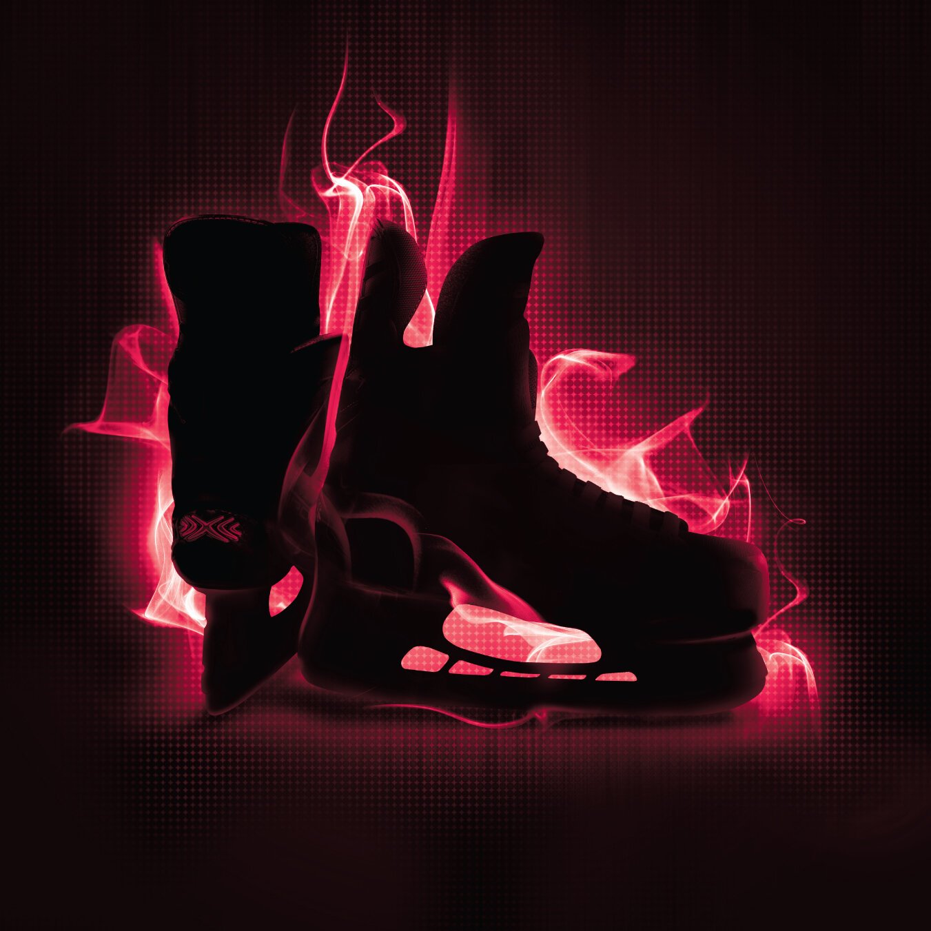
Differentiating by design, a 3-tier pricing strategy executed across each of the brand’s 3 subbrands allowed all lines to play to their strengths, while still holding together as a solitary force with a common goal in mind – win at any price point. Each line in the Bauer portfolio is designed specifically to fit the distinct needs of 3 very different types of skaters. By stepping back and evaluating the strengths of each subline Baker was able to help define the mentality of each skater and infuse that thinking into the identities of the subbrands themselves.



BRAND.BUILD
To maximize shoppability while optimizing the cans ability to stand out on shelf, the design was kept to a minimal simplicity that contrasts nicely with the surrounding noise created by a cacophony of competitors. The simple 2-level shopping experience helps consumers find their beloved copper brand on shelf, then select from their choice of variety identified by a playfully vibrant flavoring system.
BRAND.ACTIVATE
Employing a bold wrought iron black (inspired by classic European architecture) each iconic talisman is designed to simply and memorably portray its respected variety while jestingly injecting a sense of deeper meaning into the brand’s rich story.
Related Work
We are recognized as one of The Best Branding Agencies by DesignRush!

